Homepage: Your First Impression
The homepage is where a vast majority of your visits are going to start. It is also where a large number of people will first learn about your restaurant. A great homepage is welcoming and sets the tone for your brand.
On a functional level, the homepage should, at a glance, tell the viewer they are in the right place. Think of it as the greeter for your restaurant’s website. The main job of the homepage is to direct browsers to the information they are looking for.
Header: Logo/Descriptive Navigation
On most websites, the header is across the top of the page. In some cases, you find it along the left side. The header repeats on every page so it is the perfect place for a logo and website navigation. Your logo should be an easily recognized component of your brand and a key indicator to the browser that they’re in the right place.
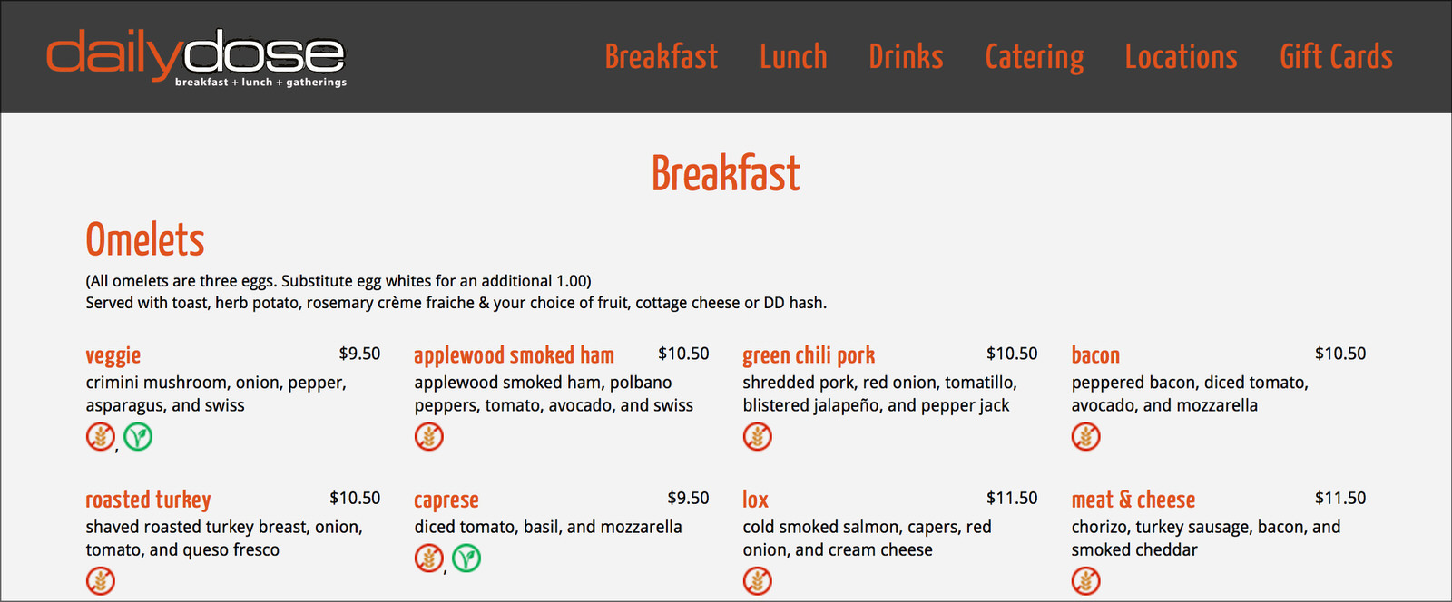
The navigation menu shows exactly what to expect. At a glance, we know we’re at Daily Dose and they serve breakfast, lunch, and drinks.
The navigation is not the place to be clever. Your navigation links should be clear and descriptive. Not only does this help people find what they’re looking for quicker, it also will help out with SEO.
Hero Shot-Featured Image
The hero shot or featured image is another way to let people know they’re in the right place. It is also an image that sets the tone for your restaurant whether it’s an appetizing plate of food or an interior shot of your restaurant to indicate ambiance.
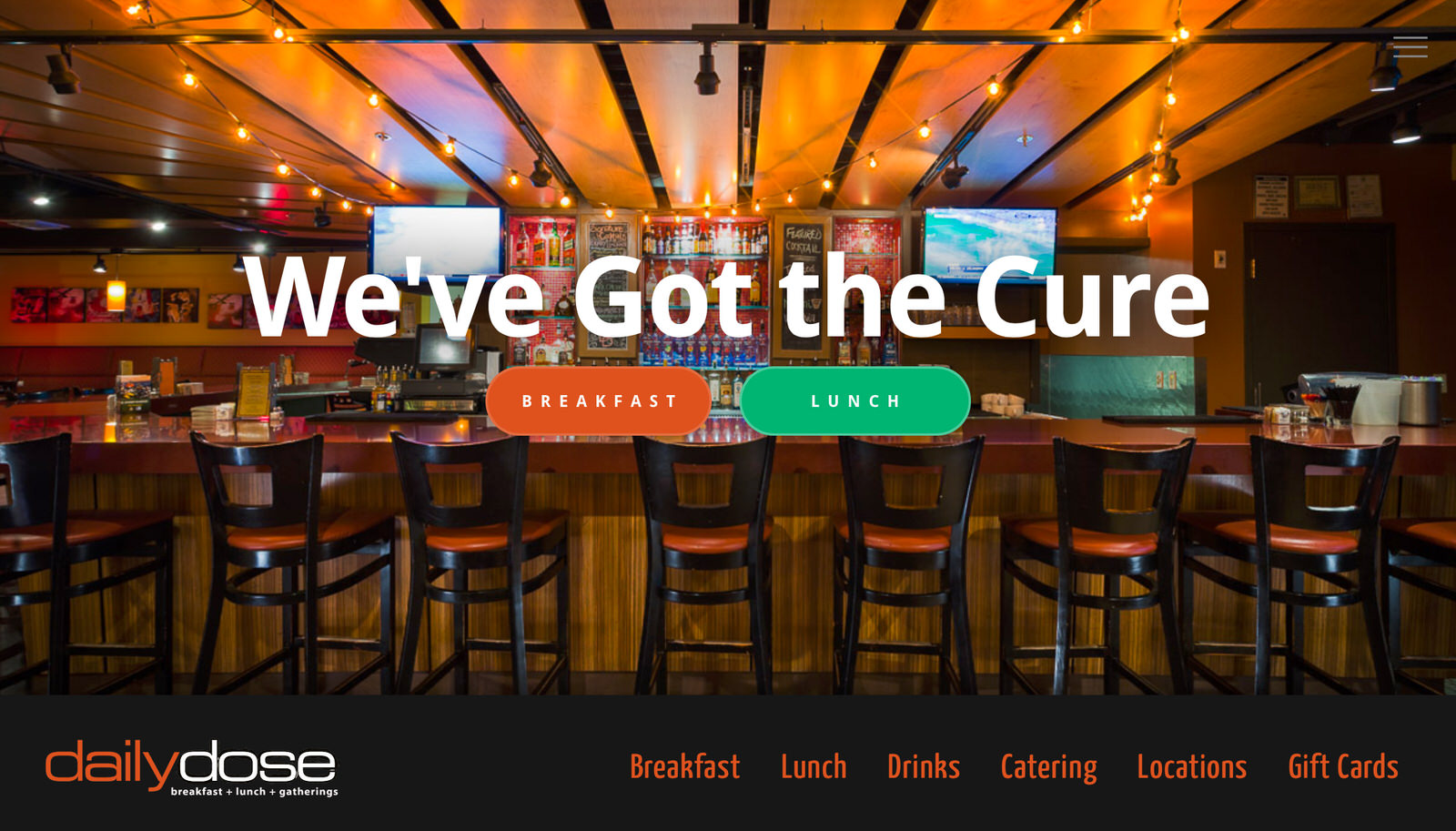
The featured image sets the tone and gives people an instant impression of your restaurant.
While the terms are sometimes used interchangeably there is a difference between a featured image and a hero shot. Simply put, a featured image is an image of the product or service and hero shot shows the benefits. For example, a great picture of your signature dish would be a featured image. An image of customers enjoying your signature dish would be a hero shot.
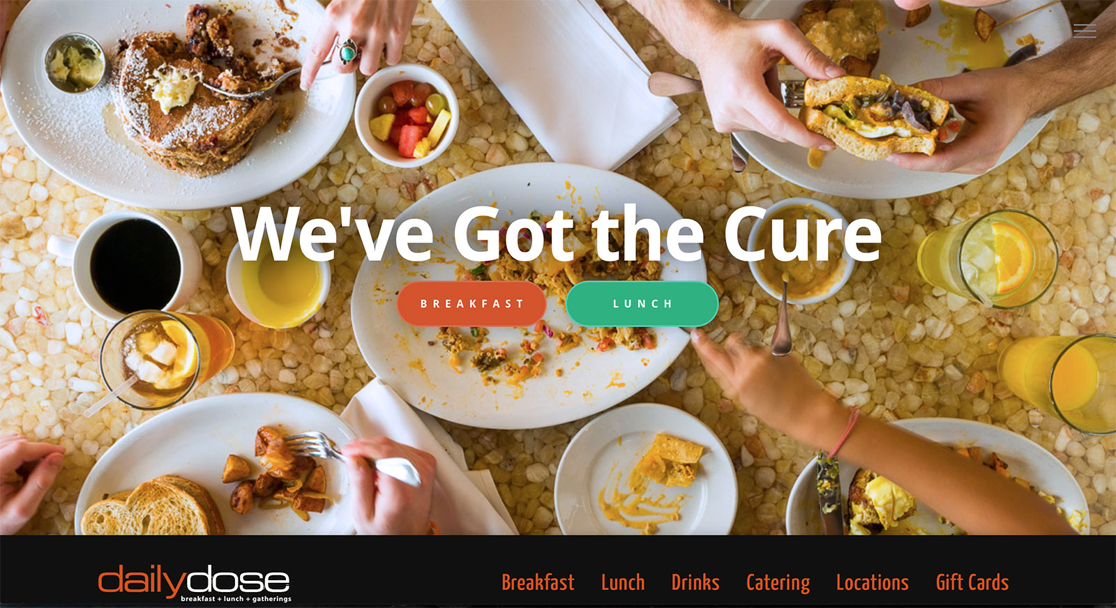
The hero shot shows people enjoying the experience.
The decision of which type of image to use depends largely on what type of image and expectation you want to project and it definitely needs to be a quality photograph. If your restaurant is a fast casual concept you probably wouldn’t want to have a featured image of finely plated food.
Address/Phone Number
One of the main things people are looking for when they come to a restaurant website is the location. Your address and phone number should be easily found by even the most casual browser. Often, they are located on the footer at the bottom of the page. The advantage to having this valuable information on the footer is the footer, like the header, shows up on every page of the website. This also helps with local SEO to ensure people in your area will find you.

The footer is a great place to include your NAP and hours on every page.
Hours
Another important piece of information most customers are looking for is when your restaurant is open. Clearly posting your hours is a must. It should be included on either in the header or in the footer depending on the design of your site. Make sure you keep this bit of information up to date. Nothing is more frustrating to customers than showing up at your restaurant when your website says you’re open only to find a closed sign.
Call to Action
The homepage is the first stop in guiding viewers through your website. What action do you want them to take?This is an opportunity to direct them to things you would like them to see. If you’ve recently updated your menu, put a notice on your homepage with a button linking them to your new menu. Did you just start offering delivery? Call attention to it and add a button so they can order right now. A call-to-action or CTA is something that gives browsers an incentive to click on a link and a great way to promote a specific offering.
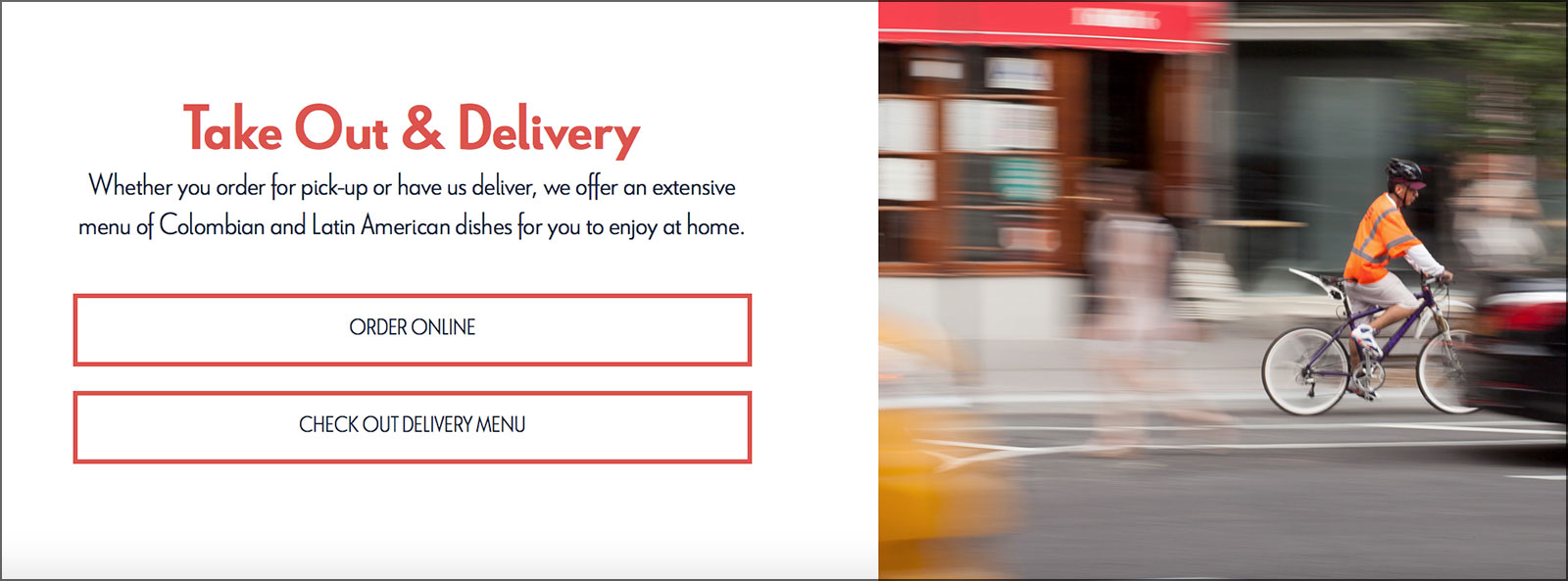
This section of a homepage calls attention to take out and delivery with buttons linking to the menu or to order now.
Bonus: What Not to Include
Here’s a bonus tip of what not to have on your homepage header: social media icons. Yup, we see it all the time. Online marketing expert Andy Crestodina from OrbitMedia in Chicago calls them “candy-colored exit signs”. While you want to encourage browsers to follow you on social media you don’t want them to leave your site until they’ve found what they’re looking for. How many times have you gone on Facebook for a specific purpose and left 20 minutes later and forgot why you went on in the first place. Exactly.
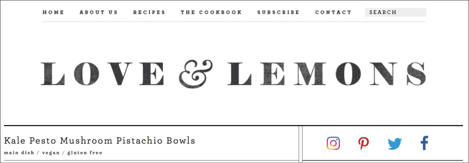
The social icons are a little toned down from the typical colored circles but are still the only colored element at the top of the page.
We usually put social media icons in the footer because that is often the last thing people see and might be ready to exit anyway.
Having these five things on your restaurant’s website will immediately put you ahead of the competition by making the most important information easily available. This will go a long way in setting the tone for your brand.
[…] educate yourself on what it takes to make an effective website. You can start with the 5 things that should be on your homepage and read about the 7 deadly sins of restaurant […]